Case Study/Categories/Brand Strategy · Brand Identity · Brand Activation
SKYLINE FINANCE
Banking built for life's next step
Bridging the Gap Between Banking and Belonging
Overview
Bridging the Gap Between Banking and Belonging
Skyline Finance is a concept for a modern credit union, designed for a new generation of professionals who want more from a financial institution than a place to park money. It is built on trust, transparency, and digital convenience, and it treats banking as part of everyday life: something that moves with people, supports their ambitions, and makes progress feel achievable.
BANKING HASN'T KEPT UP
Traditional banking was built around established financial milestones. Buying a home, building retirement savings, and planning for the distant future. But today's young professionals are navigating a different reality. Between rising living costs, student debt, career transitions, and the pursuit of financial independence, their financial priorities are constantly evolving. They need financial institutions that understand where they are today, not just where they are expected to be tomorrow. The opportunity was to create a banking brand that challenges the traditional experience and makes financial guidance feel more accessible, relevant, and personal.
BUILT AROUND PEOPLE
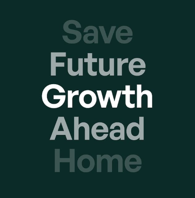
The strategy positioned Skyline Finance as a modern, member focused credit union that brings together the trust of community banking and the convenience of digital-first financial services. Designed for young professionals aged 22–35, the brand draws on the Guide and Everyman archetypes to balance expertise with approachability, creating a financial partner that feels trustworthy, relatable, and built around people's evolving ambitions.


A NEW LANGUAGE OF TRUST
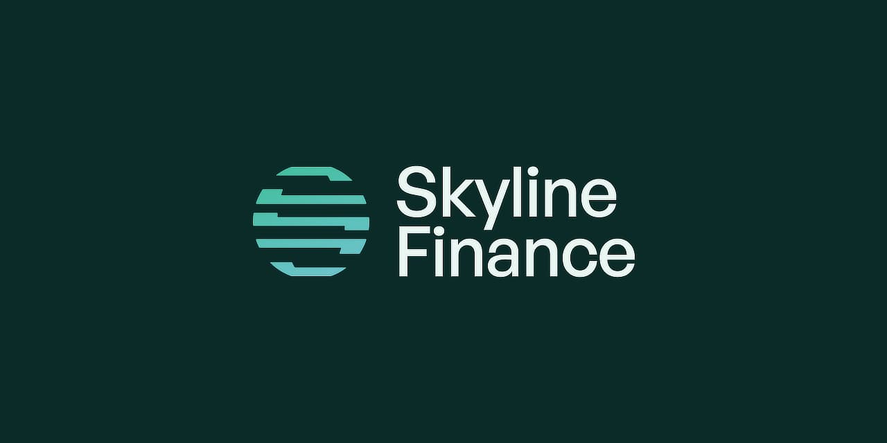
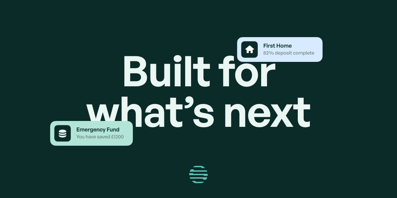
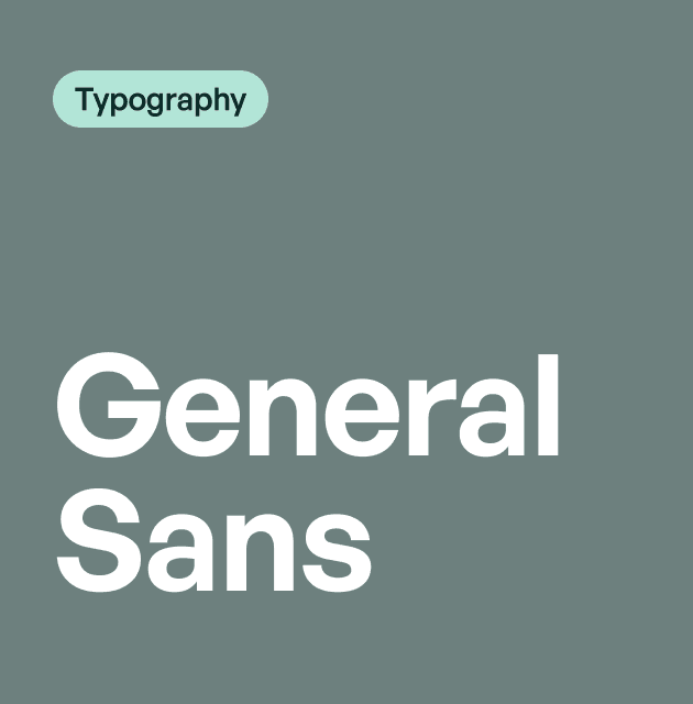
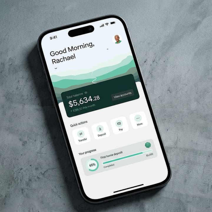
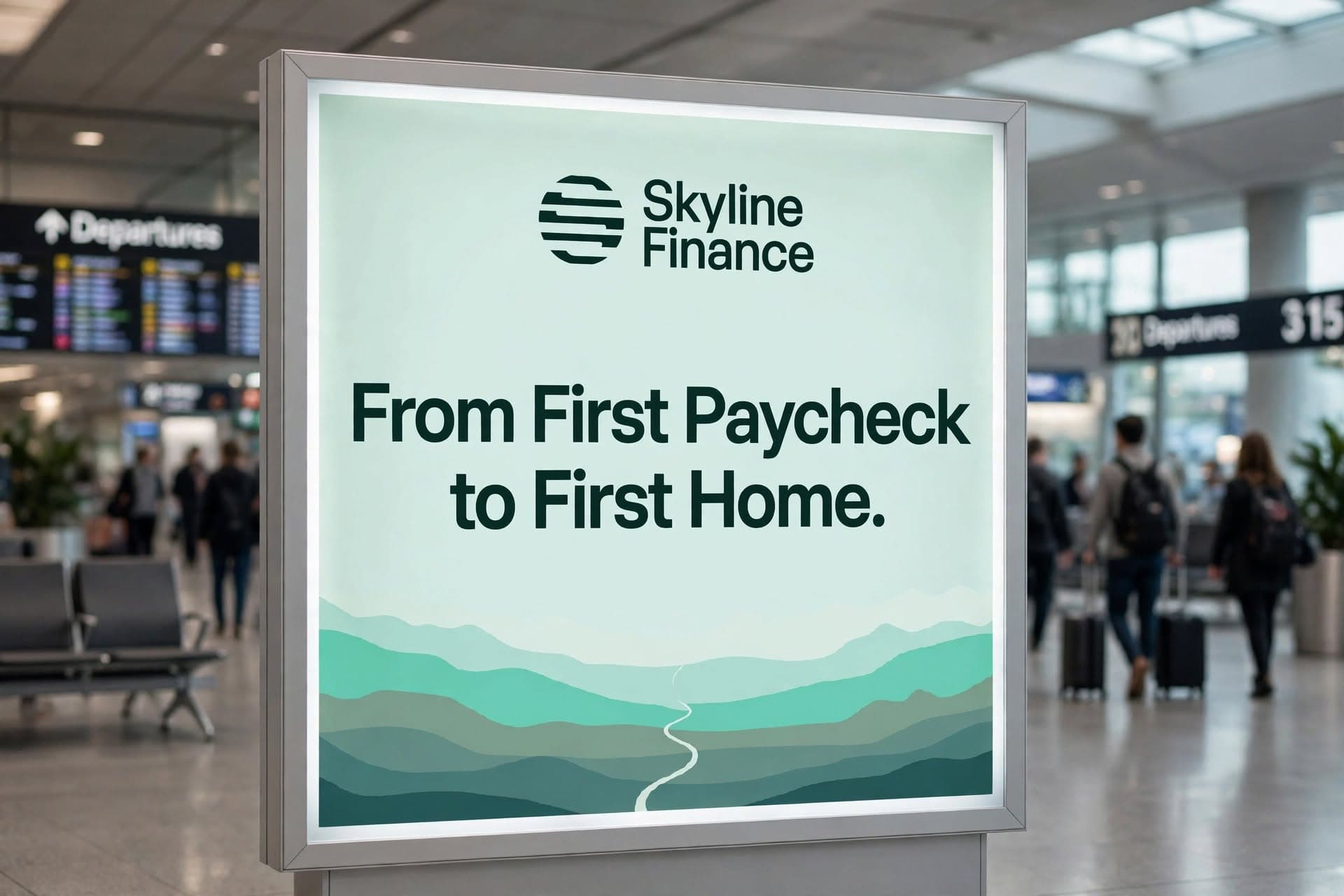
The visual identity balances the credibility of a financial institution with the freshness of a modern digital brand. A circular emblem formed from segmented horizontal lines represents movement, connection, and financial progress, while the deep forest green, vibrant mint, and crisp white palette communicate trust, freshness, and clarity. Paired with contemporary typography, the result is a confident and recognisable identity that feels established yet progressive.




Built for What's Next
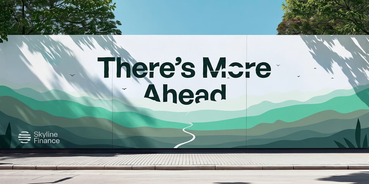
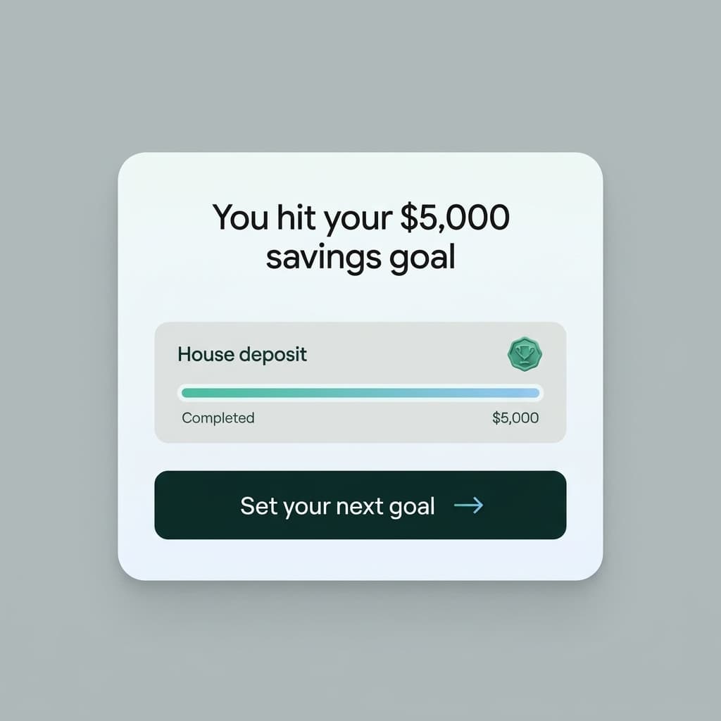
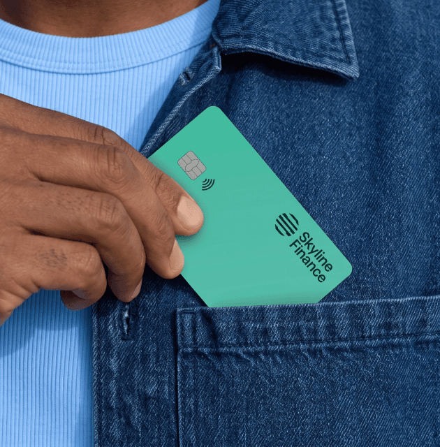
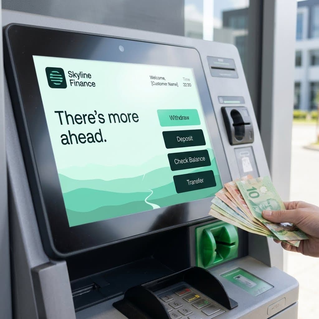
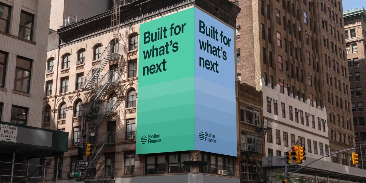
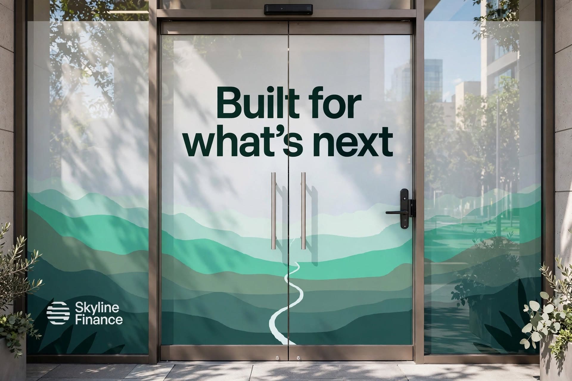
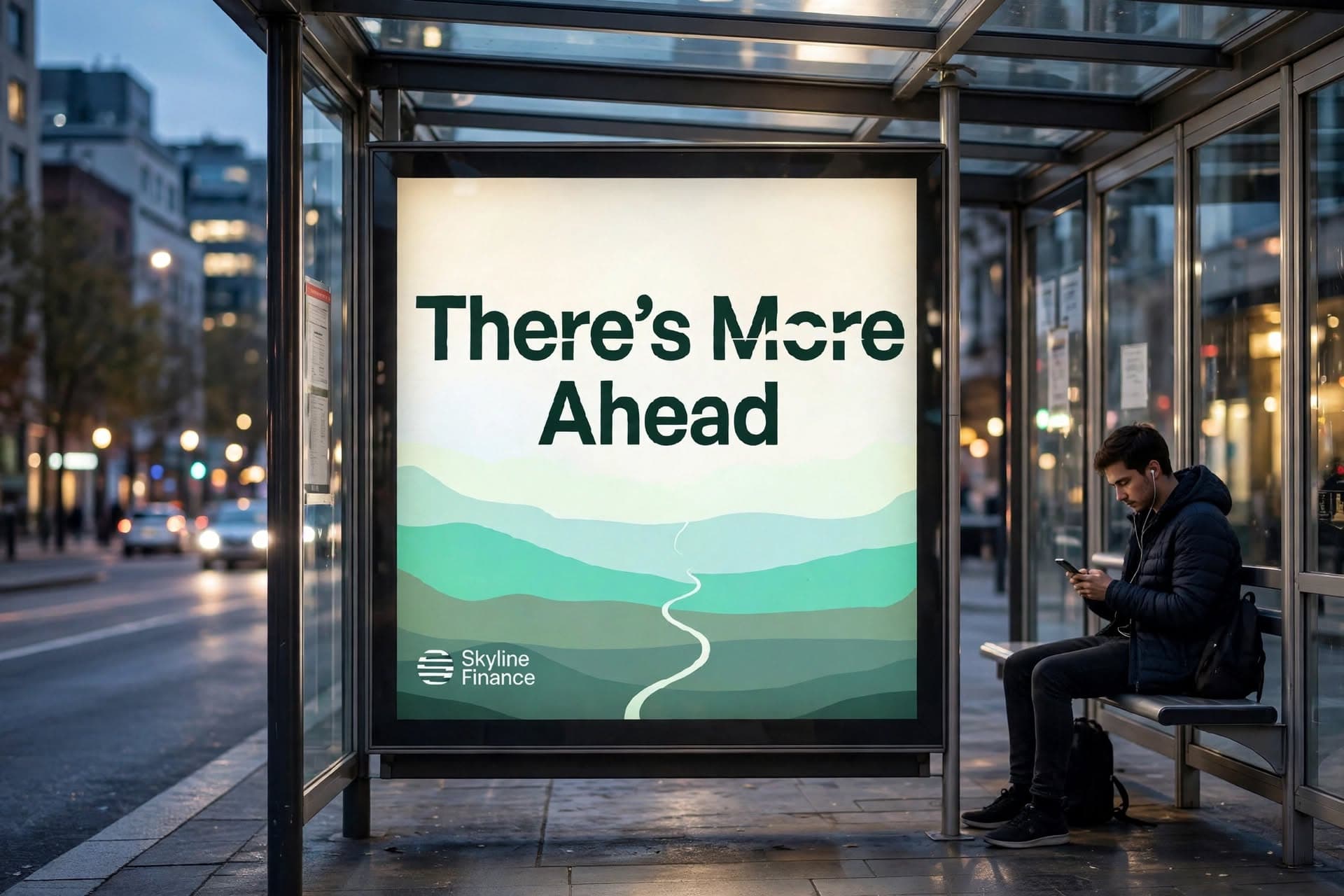
A bank brand is not judged on a brand board. It is judged at the ATM, in a phone notification, on the card that comes out of a pocket ten times a day. So the activation was designed for those moments first. The campaign lines, "There's More Ahead" and "Built for What's Next," turn functional moments into encouragement, and the identity holds the same clarity on a building-sized billboard as it does on a five-centimetre card.
Categories
SKYLINE FINANCE
Banking built for life's next step
Bridging the Gap Between Banking and Belonging
Skyline Finance is a concept for a modern credit union, designed for a new generation of professionals who want more from a financial institution than a place to park money. It is built on trust, transparency, and digital convenience, and it treats banking as part of everyday life: something that moves with people, supports their ambitions, and makes progress feel achievable.
BANKING HASN'T KEPT UP
Traditional banking was built around established financial milestones. Buying a home, building retirement savings, and planning for the distant future. But today's young professionals are navigating a different reality. Between rising living costs, student debt, career transitions, and the pursuit of financial independence, their financial priorities are constantly evolving. They need financial institutions that understand where they are today, not just where they are expected to be tomorrow. The opportunity was to create a banking brand that challenges the traditional experience and makes financial guidance feel more accessible, relevant, and personal.
BUILT AROUND PEOPLE
The strategy positioned Skyline Finance as a modern, member focused credit union that brings together the trust of community banking and the convenience of digital-first financial services. Designed for young professionals aged 22–35, the brand draws on the Guide and Everyman archetypes to balance expertise with approachability, creating a financial partner that feels trustworthy, relatable, and built around people's evolving ambitions.
A NEW LANGUAGE OF TRUST
The visual identity balances the credibility of a financial institution with the freshness of a modern digital brand. A circular emblem formed from segmented horizontal lines represents movement, connection, and financial progress, while the deep forest green, vibrant mint, and crisp white palette communicate trust, freshness, and clarity. Paired with contemporary typography, the result is a confident and recognisable identity that feels established yet progressive.
Built for What's Next
A bank brand is not judged on a brand board. It is judged at the ATM, in a phone notification, on the card that comes out of a pocket ten times a day. So the activation was designed for those moments first. The campaign lines, "There's More Ahead" and "Built for What's Next," turn functional moments into encouragement, and the identity holds the same clarity on a building-sized billboard as it does on a five-centimetre card.
Other Case Studies