Case Study/Categories/Brand Strategy
NORTHLAKE HEALTH
Healthcare designed around people, not patients.
Healthcare often feels fragmented. Northlake makes it feel connected.
Overview
Healthcare often feels fragmented. Northlake makes it feel connected.
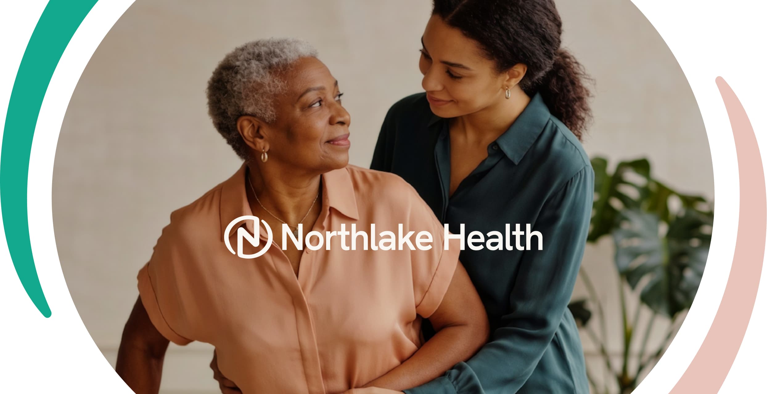
Northlake Health is a modern multidisciplinary clinic bringing together family medicine, physiotherapy, mental health support, and wellness under one trusted brand. The opportunity was not just to say "we offer several services" but to show the value of having different aspects of health supported in one place, by one brand people can trust.
you Shouldn't Have to Navigate Your Health Alone
The core problem was fragmentation. Care felt reactive and impersonal, with long wait times and limited preventive guidance. The brand needed to own a clear transformation, from uncertainty to confidence, from reactive treatment to proactive wellness, from disconnected experiences to trusted long-term care relationships.
Calm, Not Clinical.
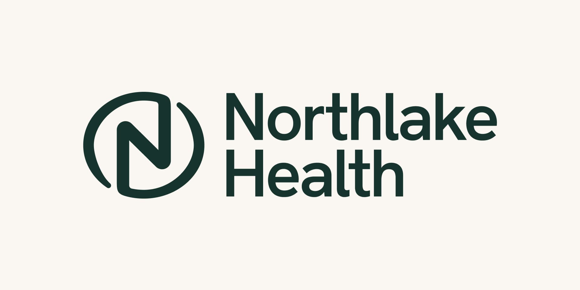
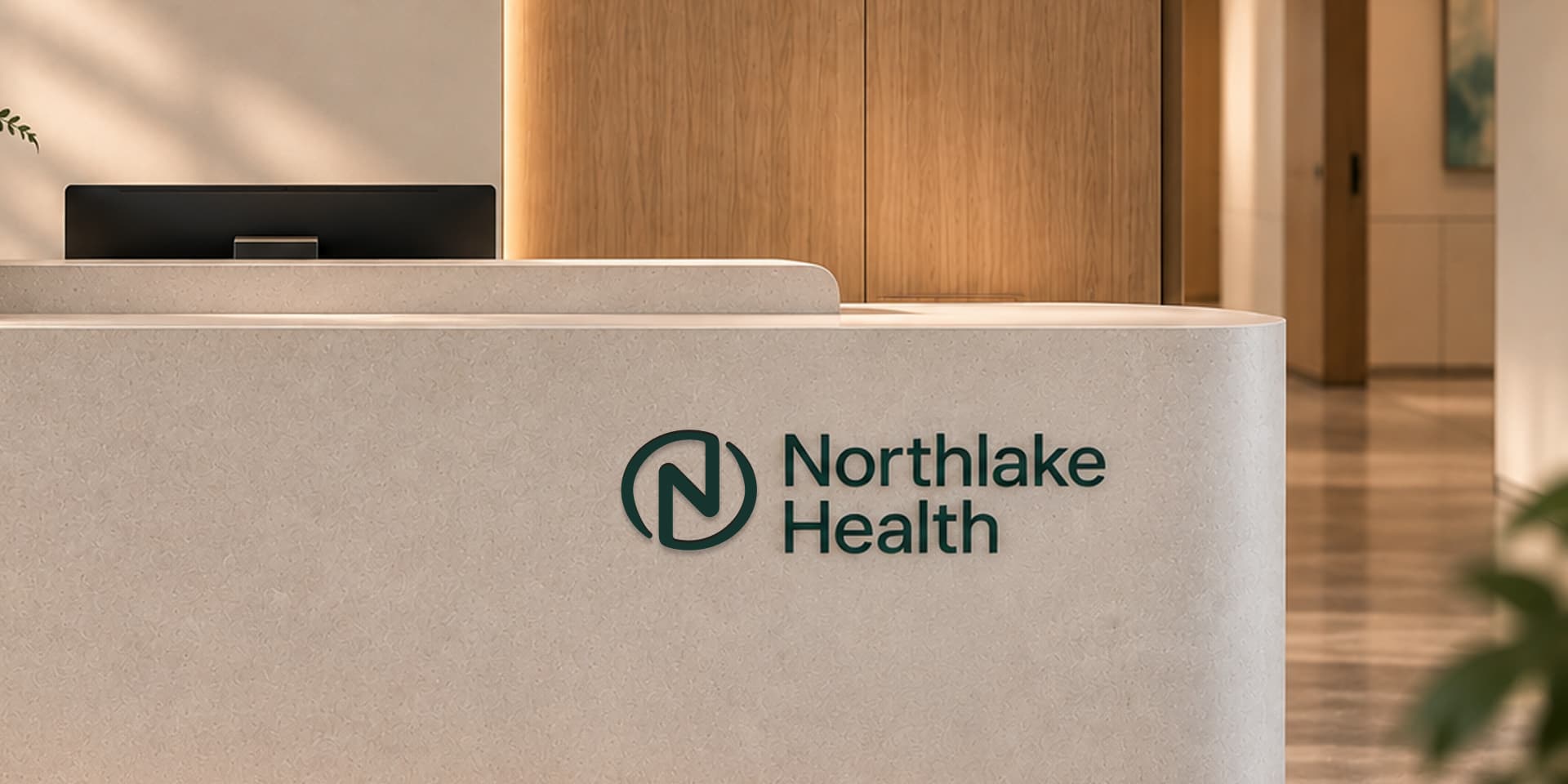
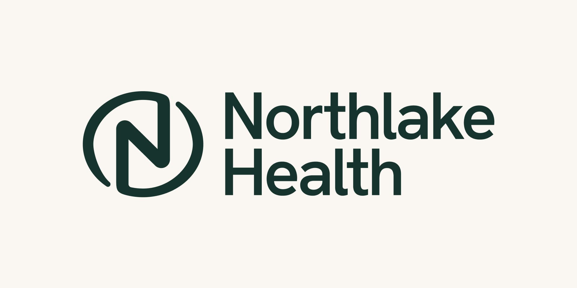
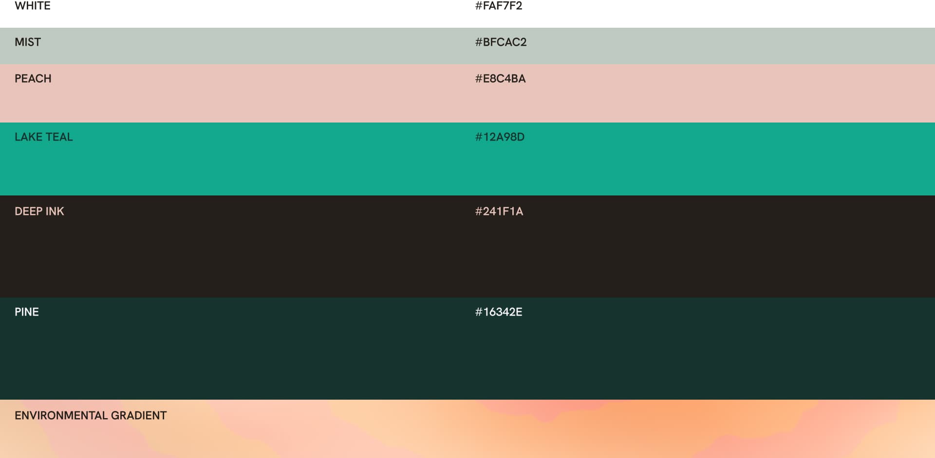
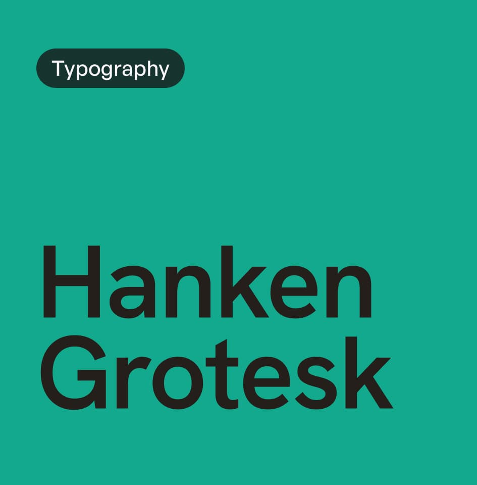
The visual identity was designed to feel calm, modern and reassuring, not clinical or institutional. The N in circle emblem was refined with intentional breathing room so the N never touches the circle, sharp and opaque in Pine. The palette is White and Mist as base, with Peach for warmth, Lake Teal for care accents and Pine and Deep Ink for trust and text. Hanken Grotesk carries the voice, approachable and professional, with soft curved arcs and generous white space across all touchpoints

Making Connected Care Feel Real Everywhere
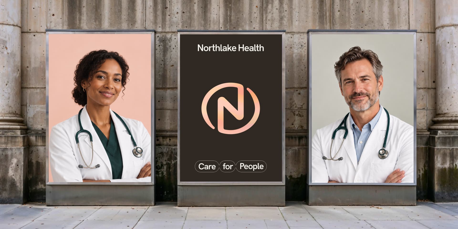
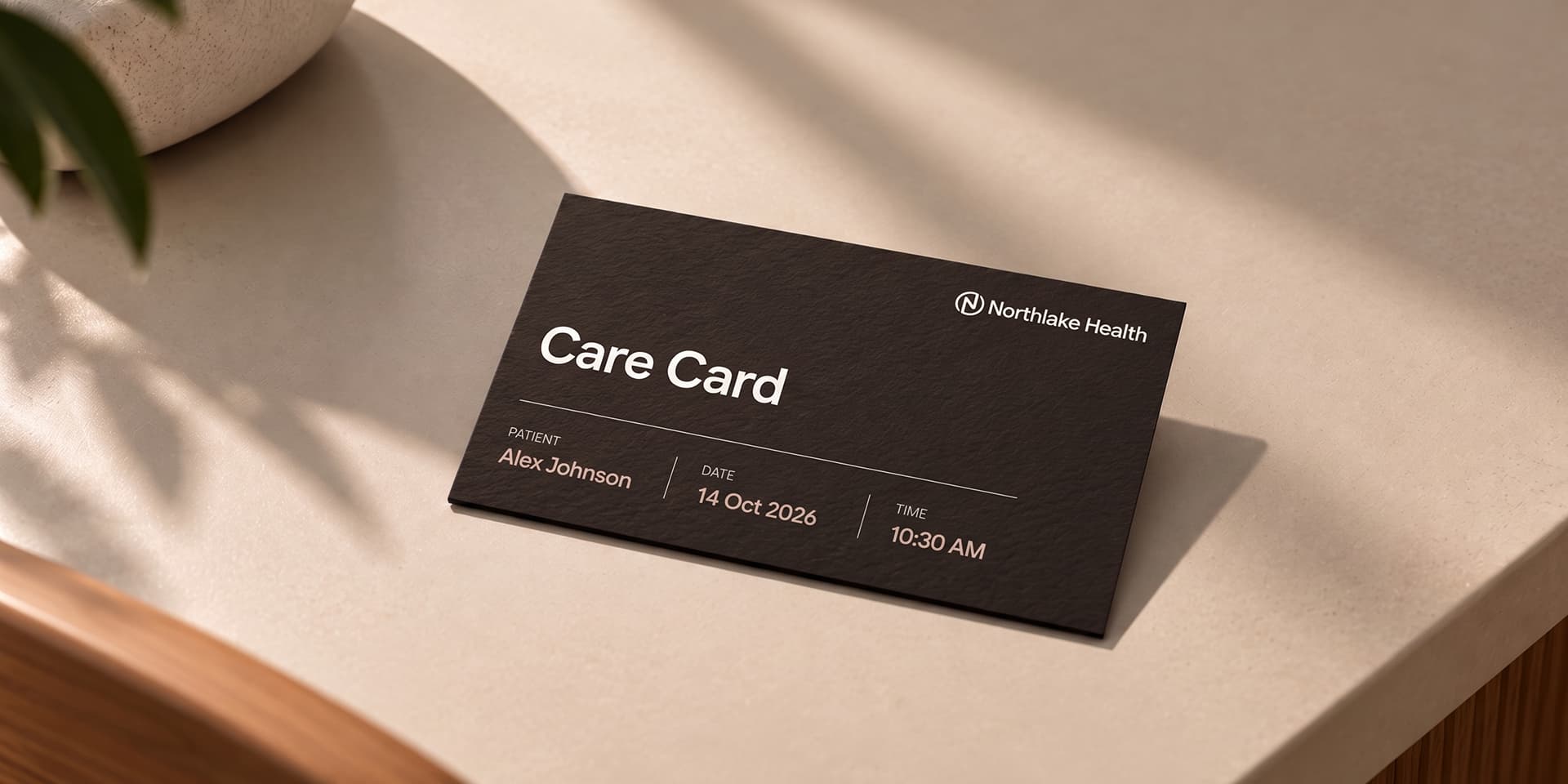
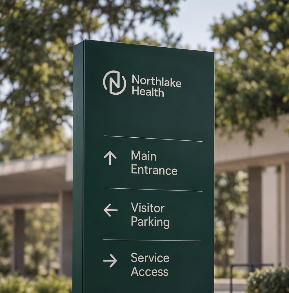
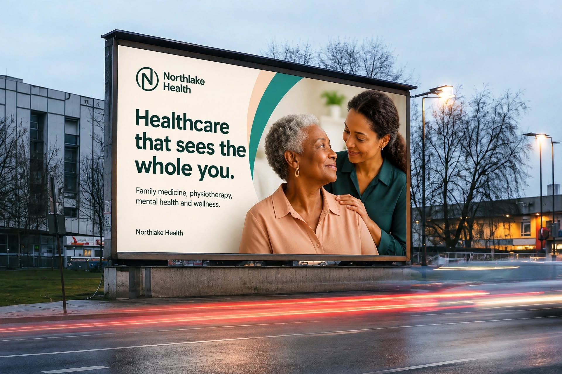
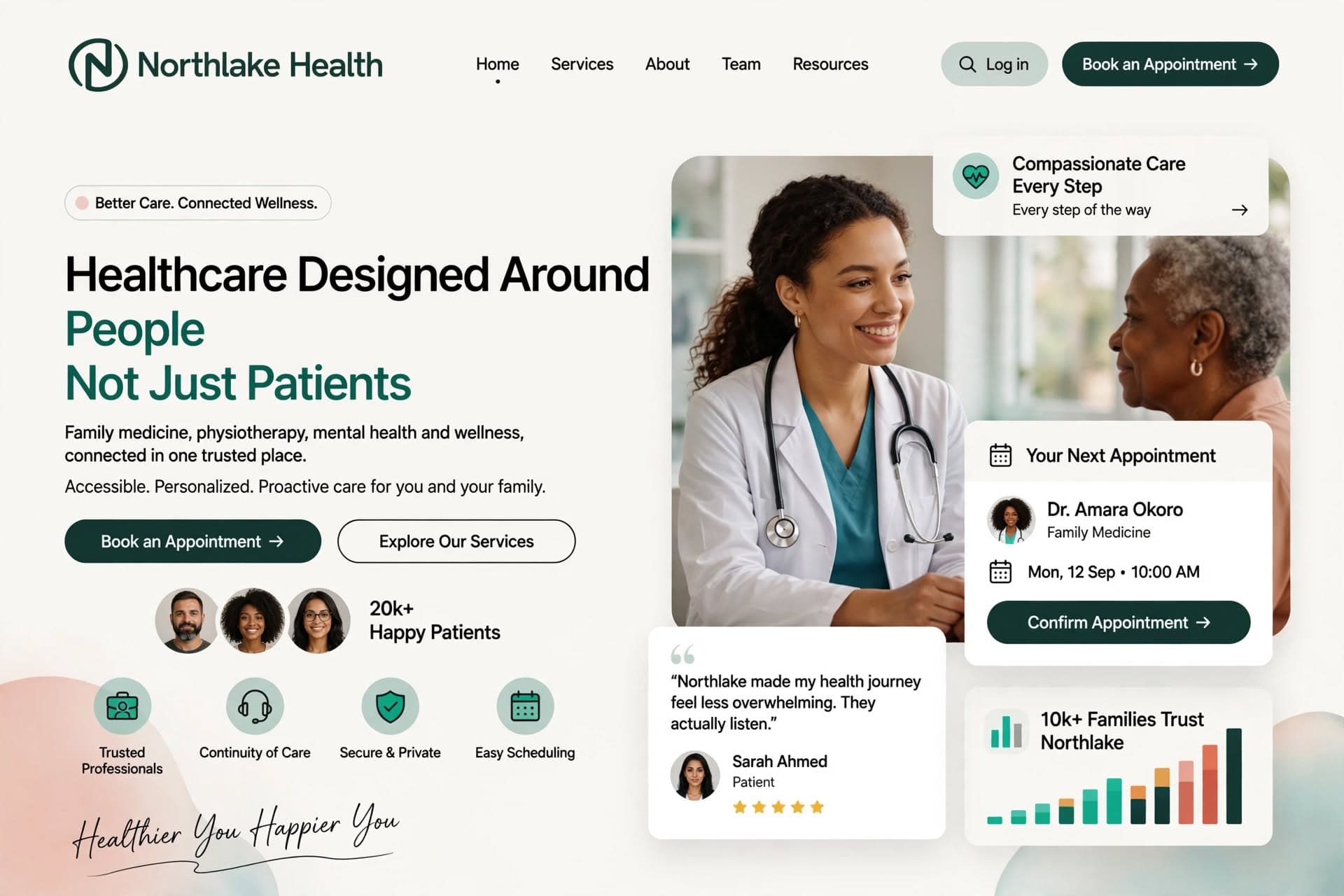
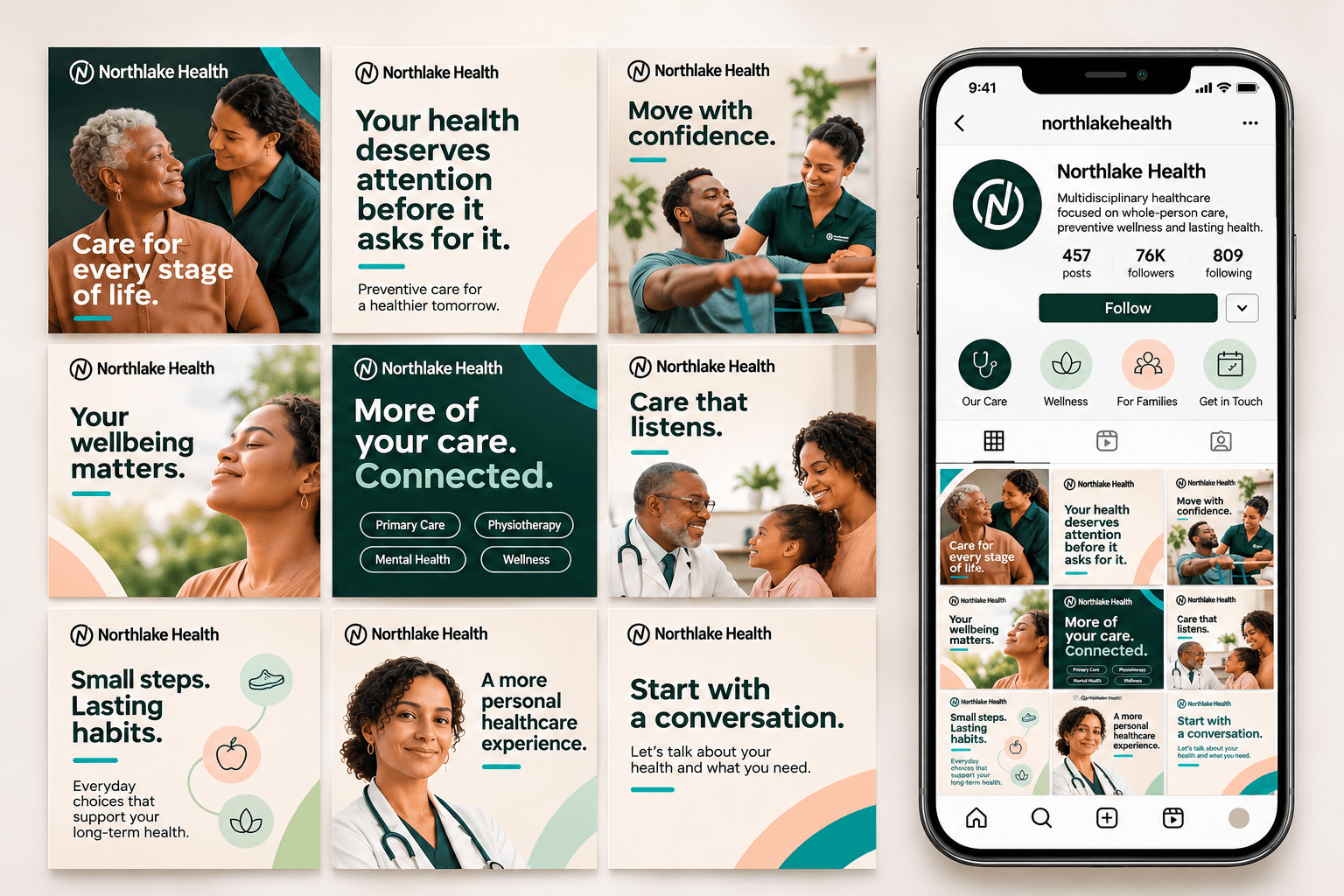
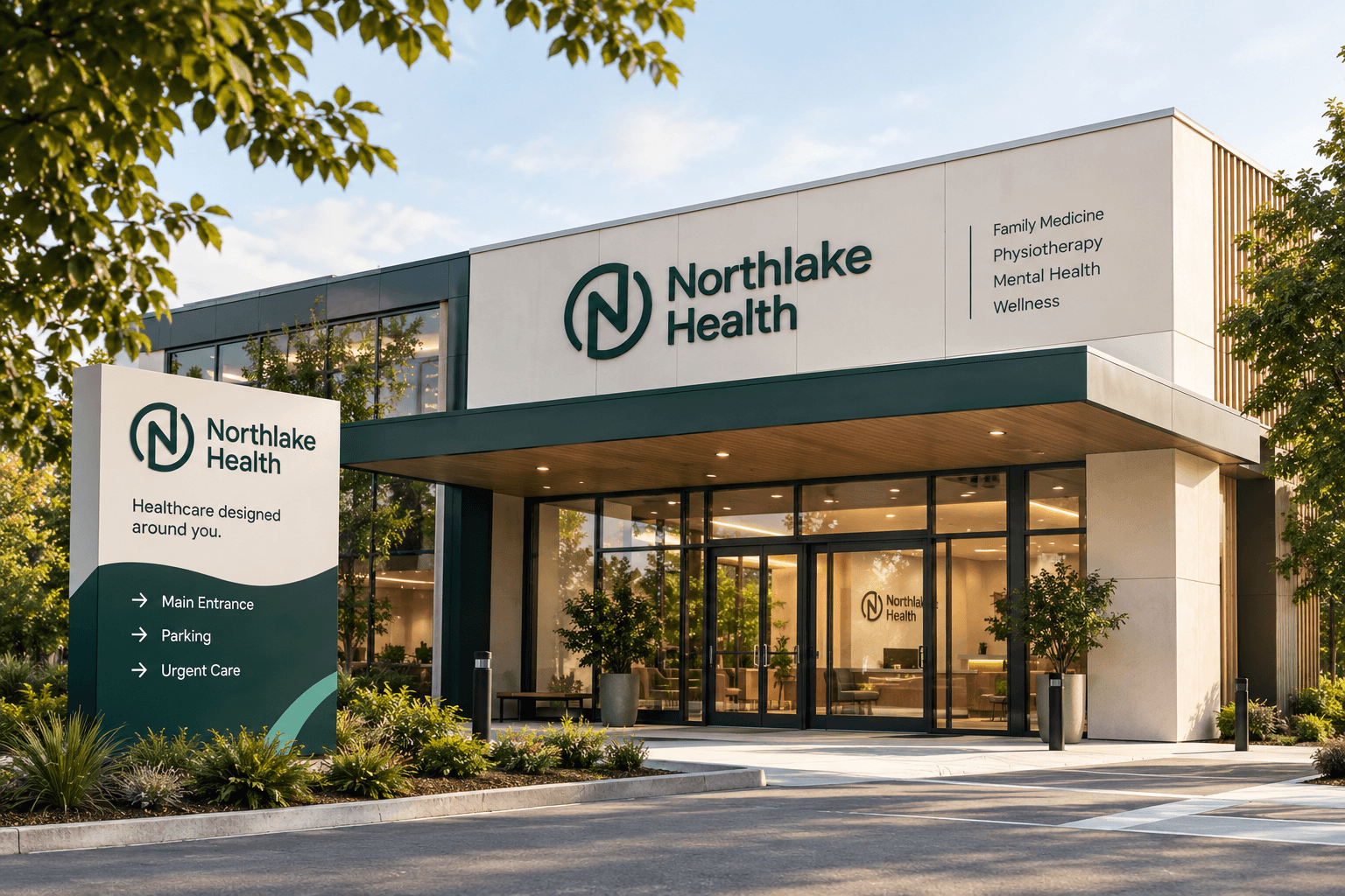
Strategy was translated into real patient touchpoints. For awareness, a billboard and transit system with messages like Healthcare that sees the whole you and More of your care connected. For information, a flyer and brochure family covering primary care, physiotherapy, mental health, wellness and employer care. For guidance, a responsive patient facing website designed as a Modern Healthcare Experience, desktop and mobile showing trusted walk in medical care for the community. For reassurance, clinic signage, wayfinding, appointment cards, scrubs and ID badges. For education and community, a diverse and cleaner Instagram grid showing families of all backgrounds, including White, Black, Hispanic and South Asian including a Sikh gentleman, with a crisp profile emblem that feels properly printed.
Categories
NORTHLAKE HEALTH
Healthcare designed around people, not patients.
Healthcare often feels fragmented. Northlake makes it feel connected.
Northlake Health is a modern multidisciplinary clinic bringing together family medicine, physiotherapy, mental health support, and wellness under one trusted brand. The opportunity was not just to say "we offer several services" but to show the value of having different aspects of health supported in one place, by one brand people can trust.
you Shouldn't Have to Navigate Your Health Alone
The core problem was fragmentation. Care felt reactive and impersonal, with long wait times and limited preventive guidance. The brand needed to own a clear transformation, from uncertainty to confidence, from reactive treatment to proactive wellness, from disconnected experiences to trusted long-term care relationships.
Calm, Not Clinical.
The visual identity was designed to feel calm, modern and reassuring, not clinical or institutional. The N in circle emblem was refined with intentional breathing room so the N never touches the circle, sharp and opaque in Pine. The palette is White and Mist as base, with Peach for warmth, Lake Teal for care accents and Pine and Deep Ink for trust and text. Hanken Grotesk carries the voice, approachable and professional, with soft curved arcs and generous white space across all touchpoints
Making Connected Care Feel Real Everywhere
Strategy was translated into real patient touchpoints. For awareness, a billboard and transit system with messages like Healthcare that sees the whole you and More of your care connected. For information, a flyer and brochure family covering primary care, physiotherapy, mental health, wellness and employer care. For guidance, a responsive patient facing website designed as a Modern Healthcare Experience, desktop and mobile showing trusted walk in medical care for the community. For reassurance, clinic signage, wayfinding, appointment cards, scrubs and ID badges. For education and community, a diverse and cleaner Instagram grid showing families of all backgrounds, including White, Black, Hispanic and South Asian including a Sikh gentleman, with a crisp profile emblem that feels properly printed.
Other Case Studies