Case Study/Categories/Brand Strategy
GreenSpark Energy
Making Clean Energy More Accessible
GreenSpark Energy is a fictional renewable energy company created to make clean energy simpler, more accessible, and easier to adopt. Serving homeowners, businesses, and communities, the brand brings together innovative energy solutions and clear communication to make the transition toward a cleaner future feel more achievable.
Overview
GreenSpark Energy is a fictional renewable energy company created to make clean energy simpler, more accessible, and easier to adopt. Serving homeowners, businesses, and communities, the brand brings together innovative energy solutions and clear communication to make the transition toward a cleaner future feel more achievable.
Making Clean Energy Feel Within Reach
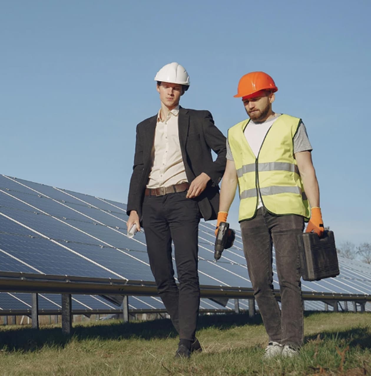
Renewable energy offers significant possibilities, but for many people, understanding the technology, costs, and available solutions can feel overwhelming. GreenSpark needed a brand that could simplify the conversation, build trust, and make renewable energy feel less intimidating. The challenge was to communicate innovation without unnecessary complexity and sustainability without relying on predictable environmental messaging.
From Uncertainty to Confidence
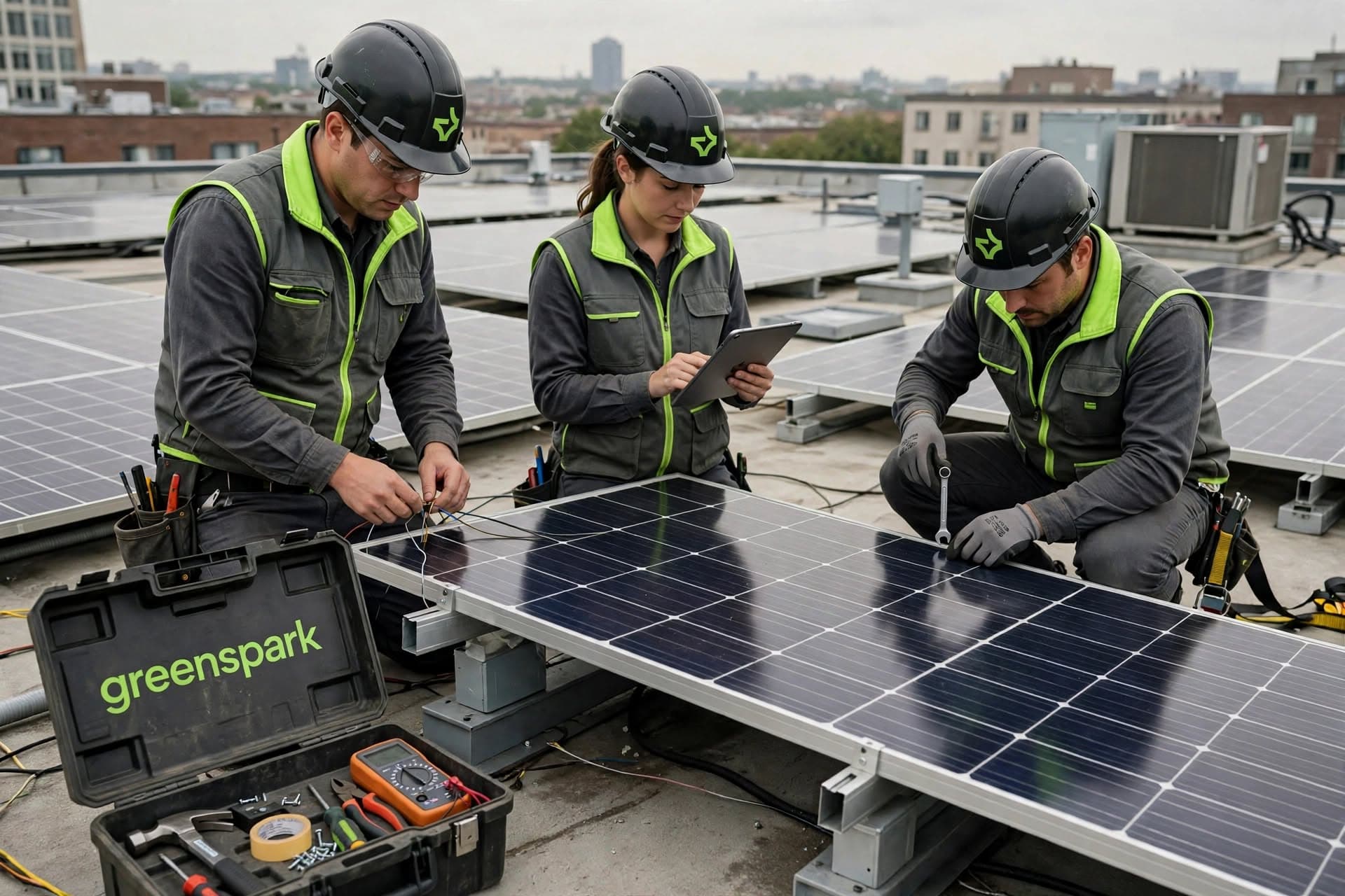
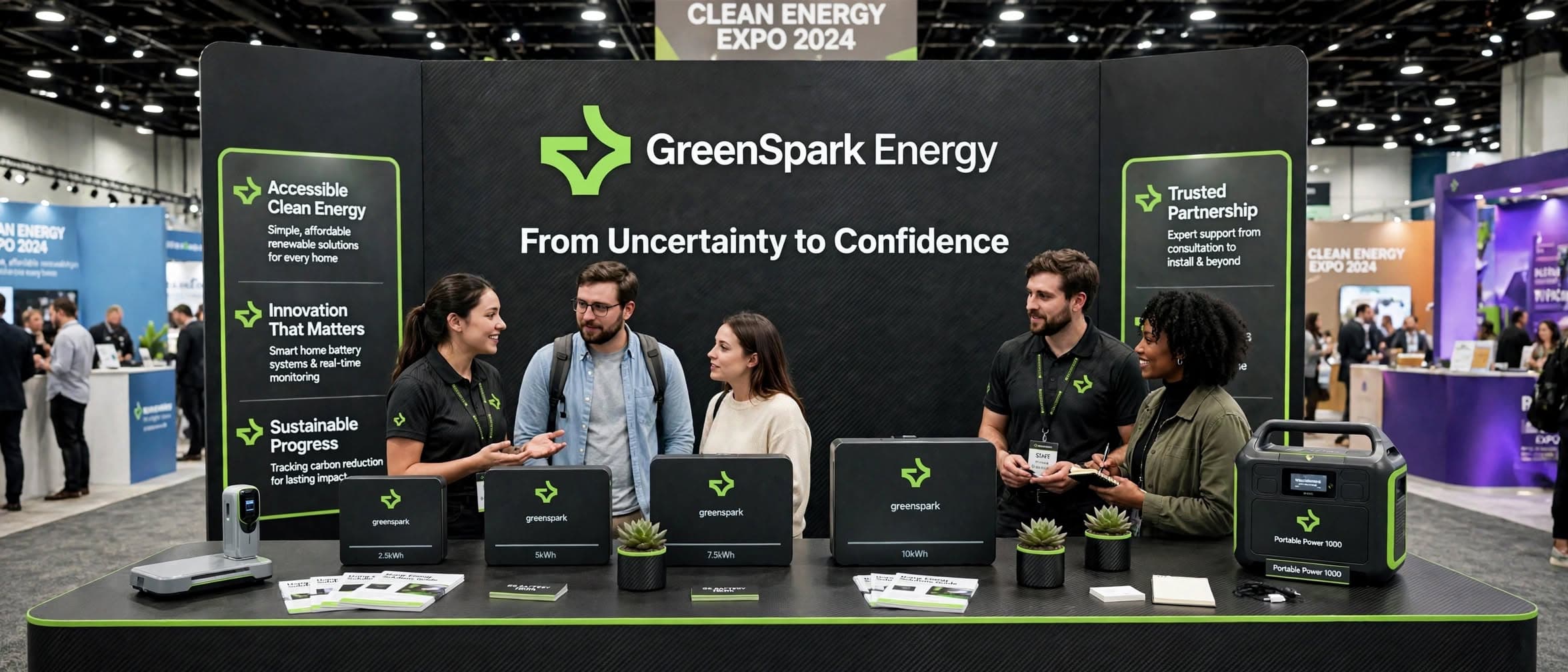
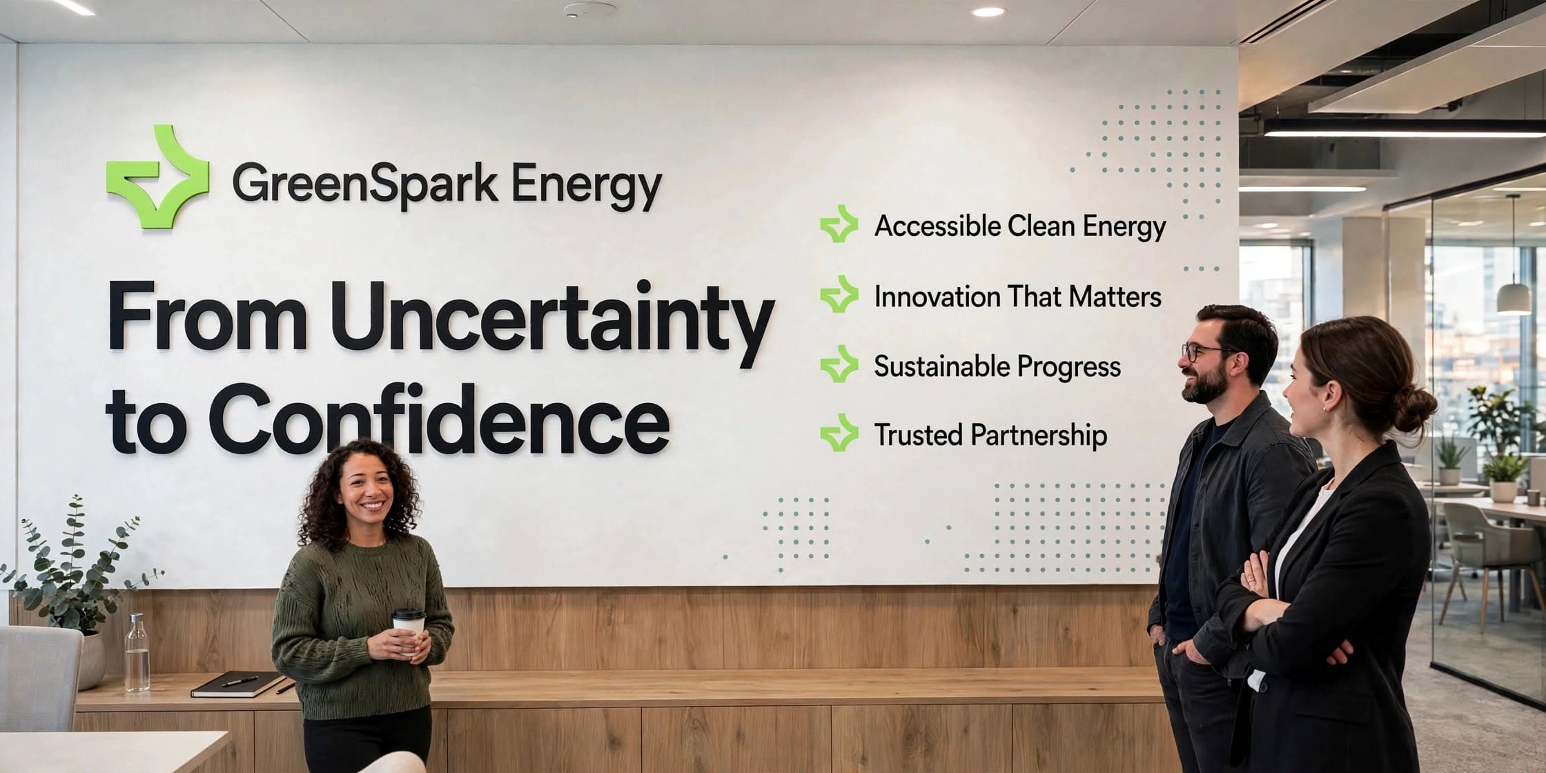
GreenSpark was positioned as an approachable renewable energy partner, making clean energy easier to understand, trust, and adopt. Its messaging centres on accessible energy, meaningful innovation, sustainable progress, and trusted partnership. Guided by the Explorer and Caregiver archetypes, the brand communicates optimism, innovation, and a people-first approach.
Energy with a Clearer Perspective
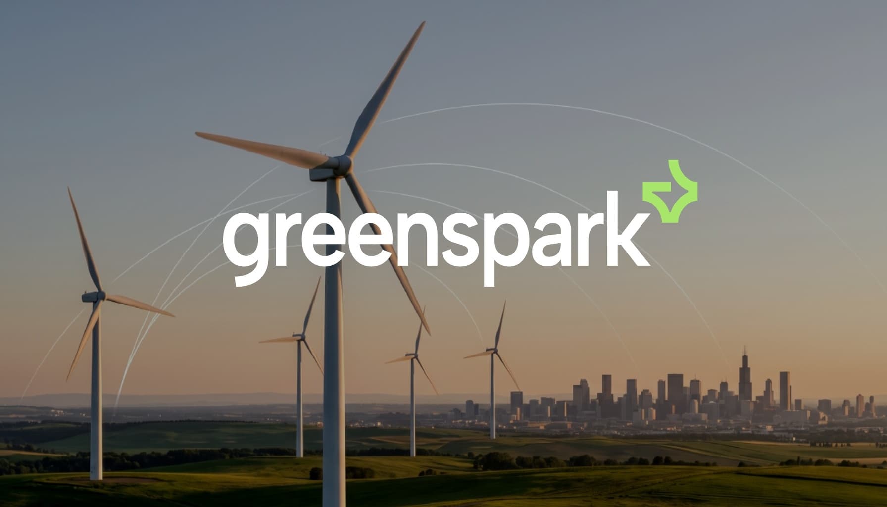
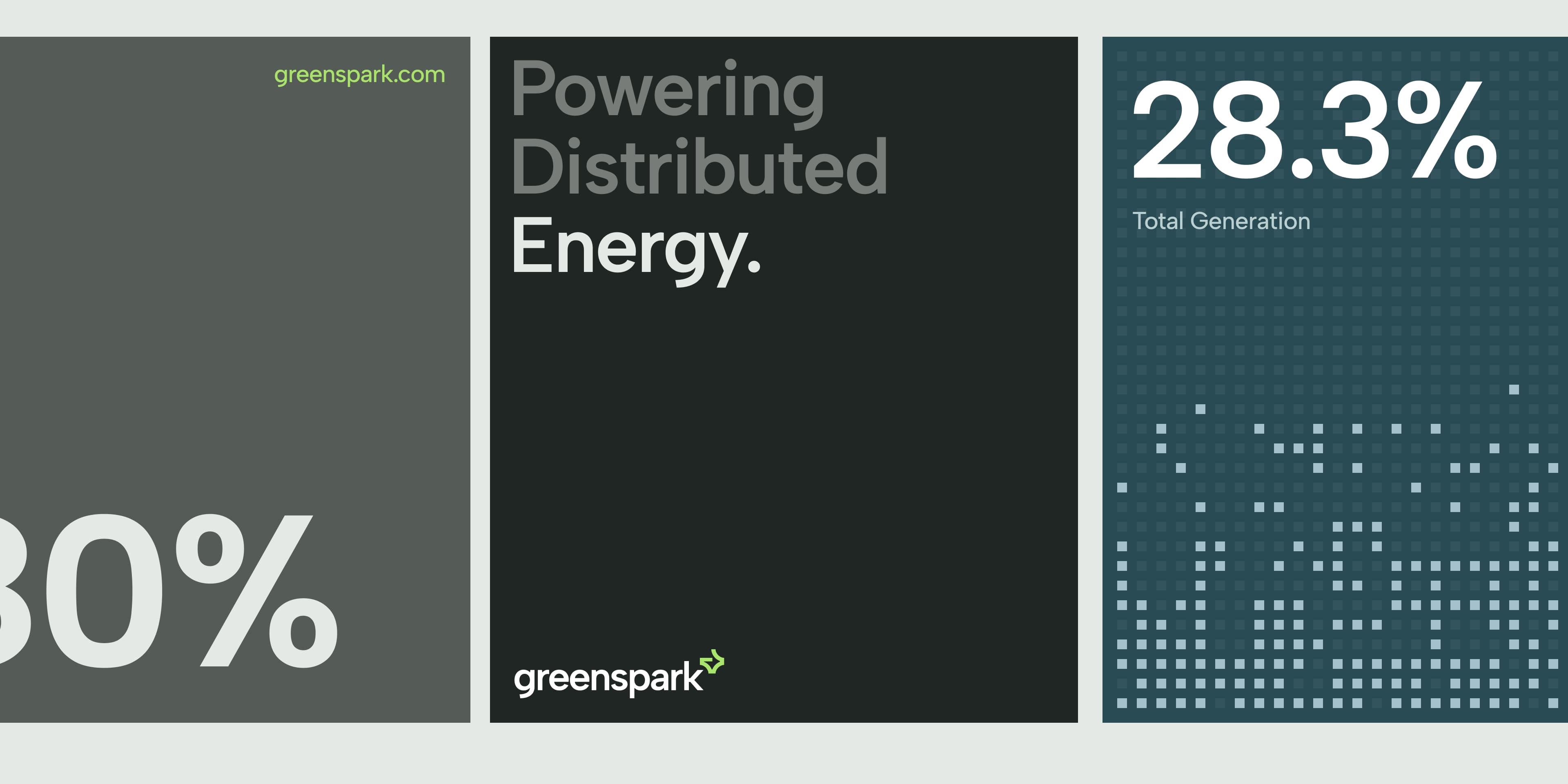
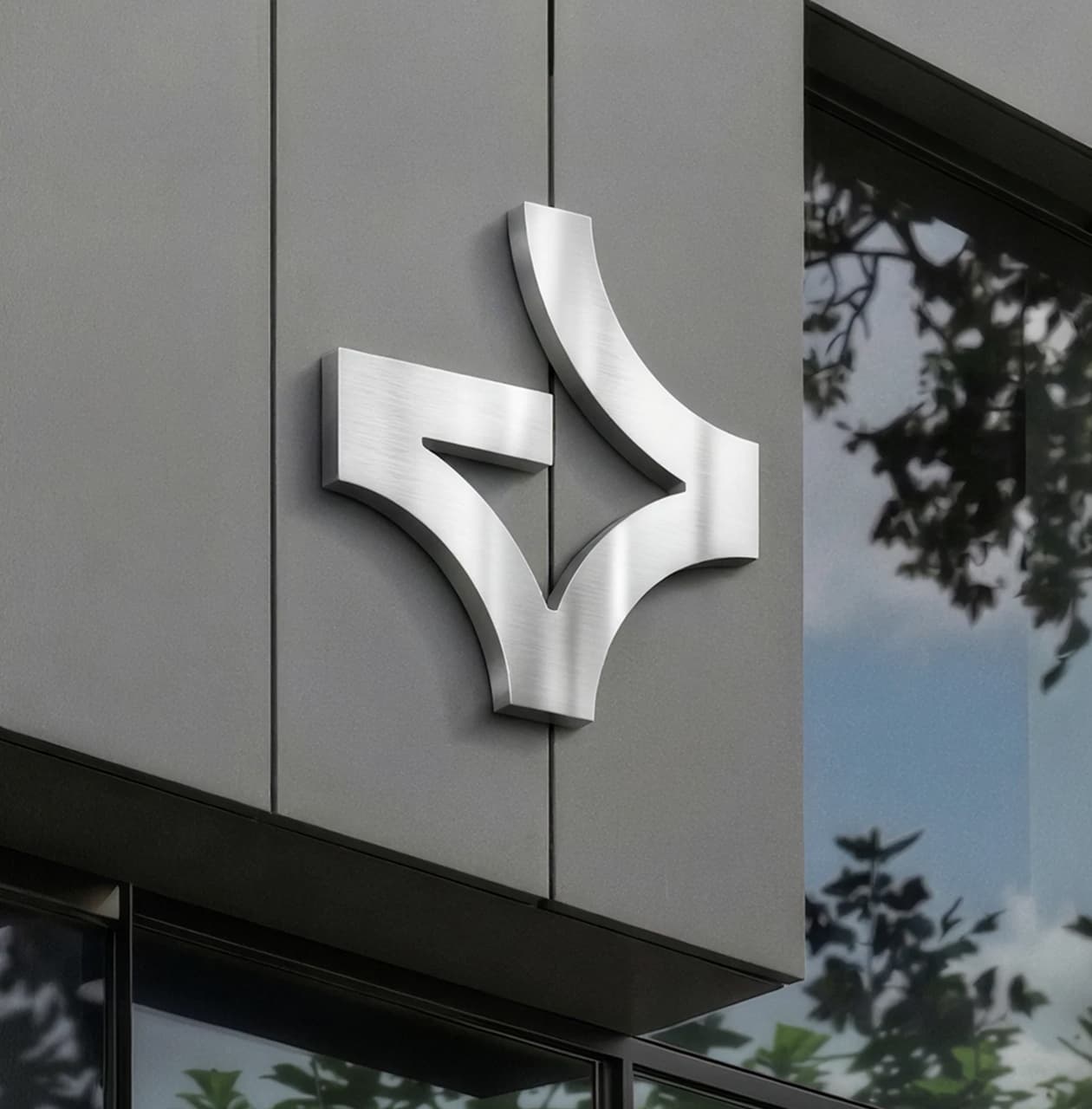
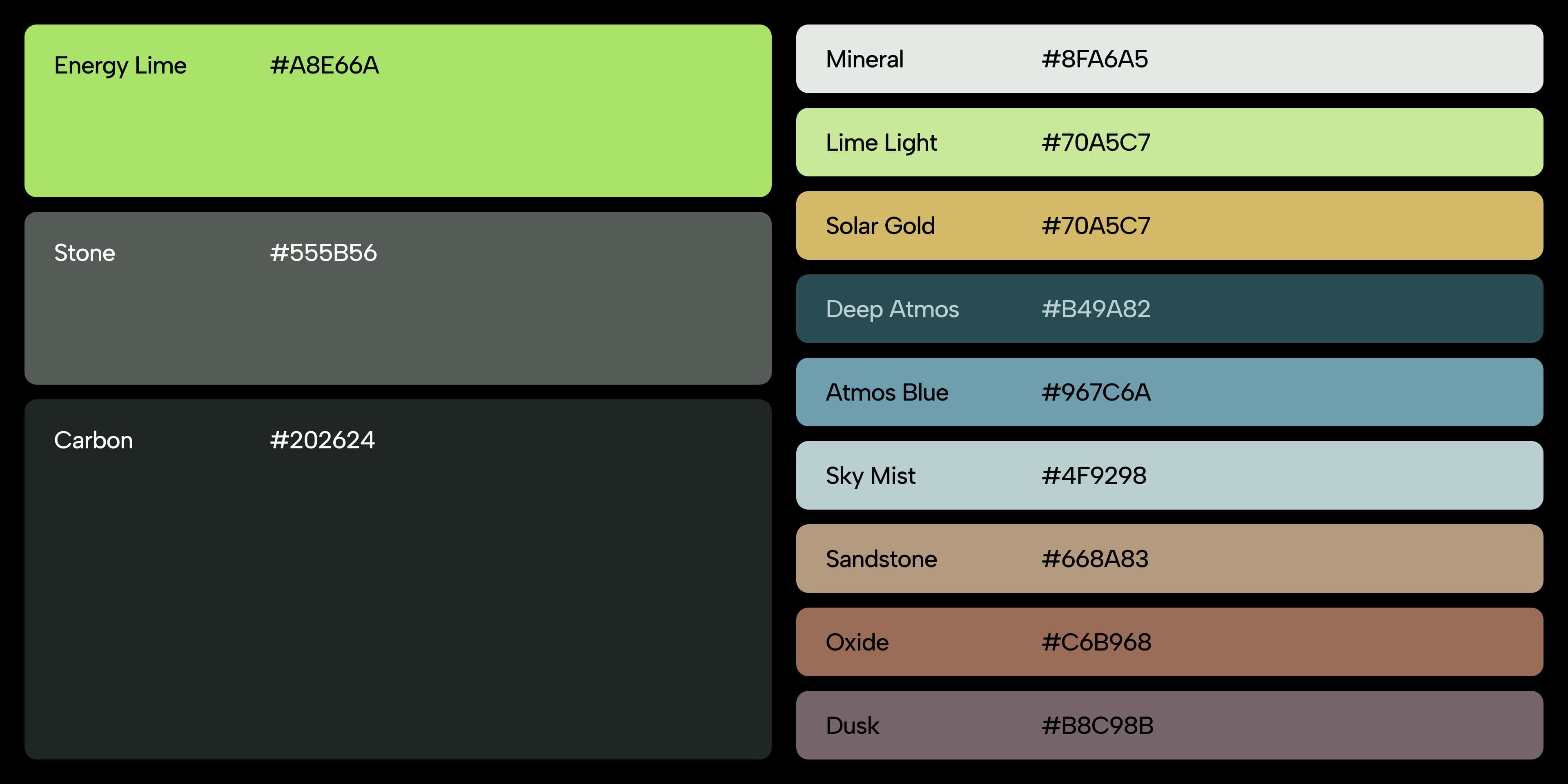
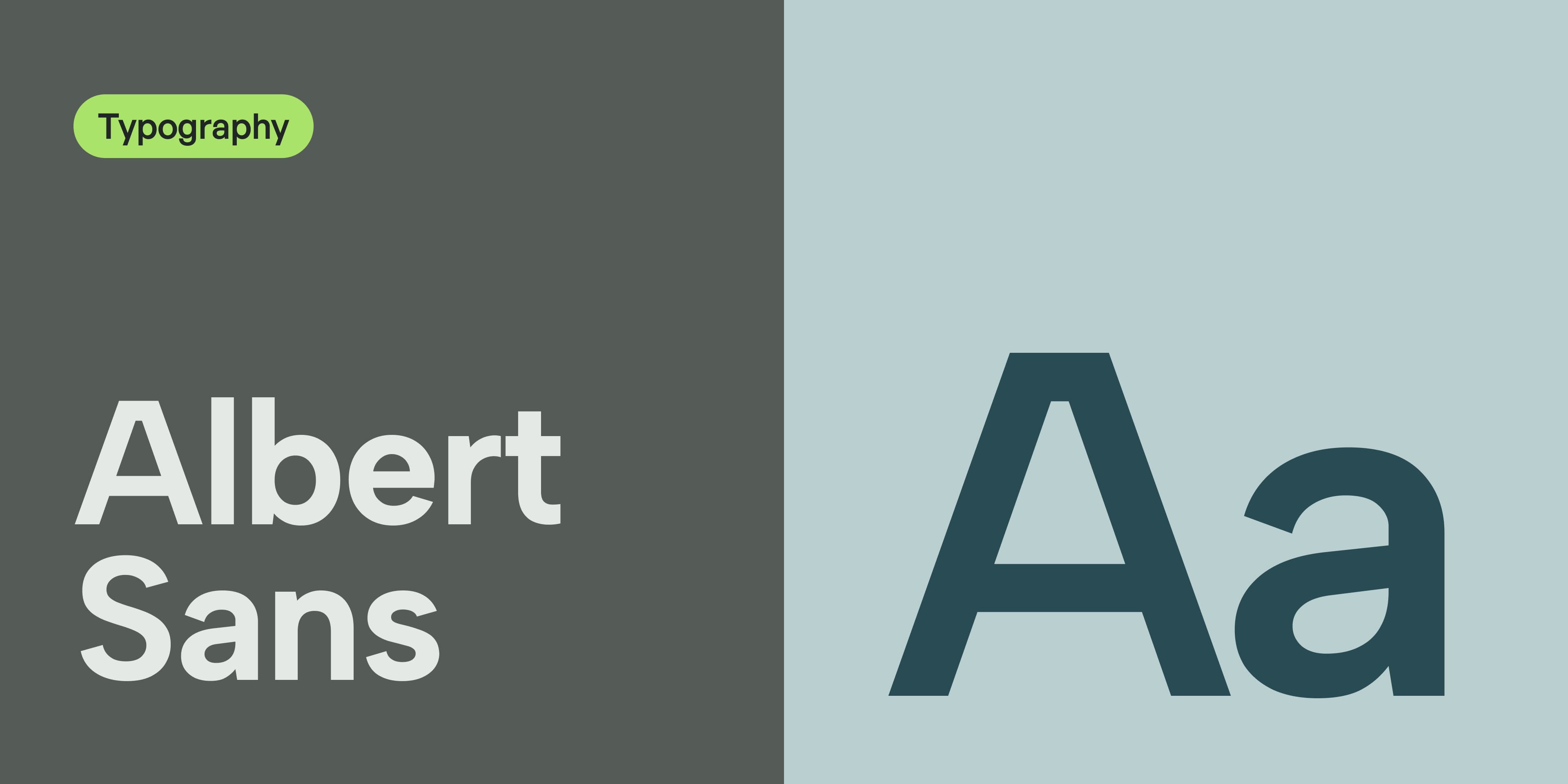
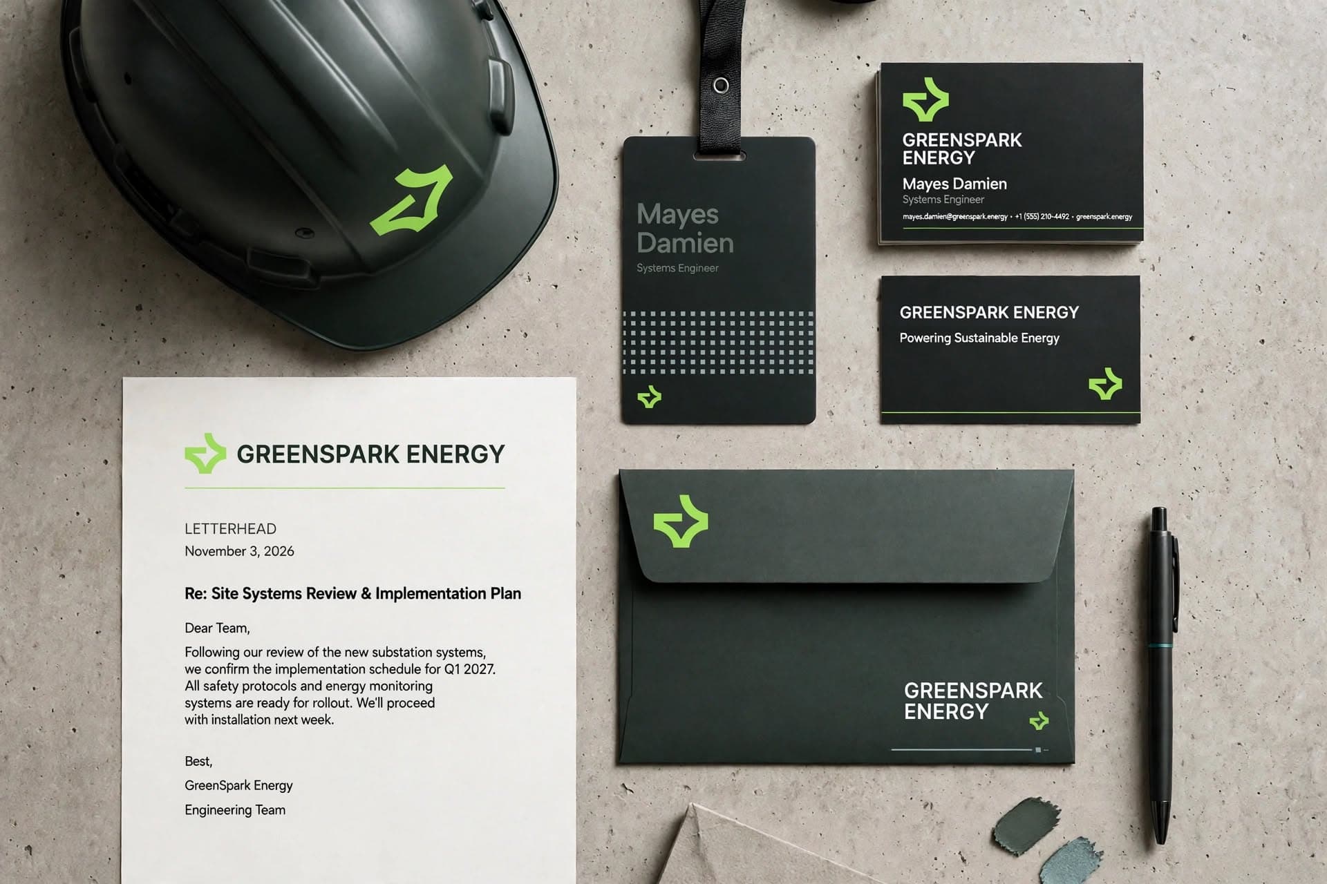
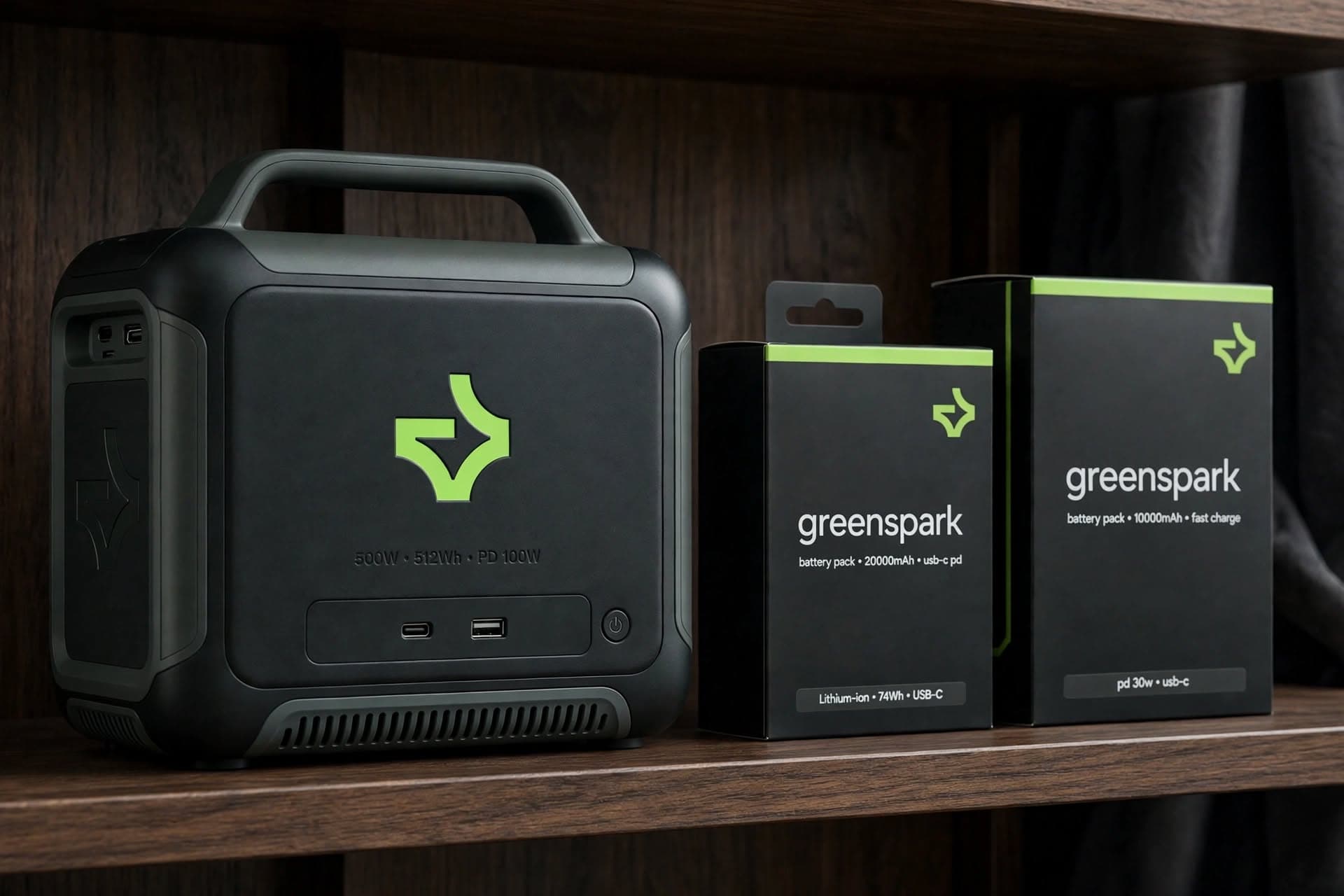
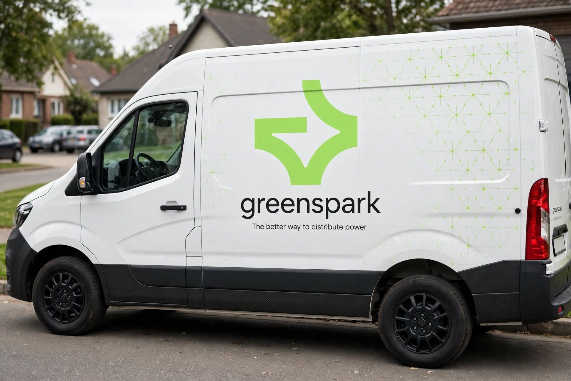
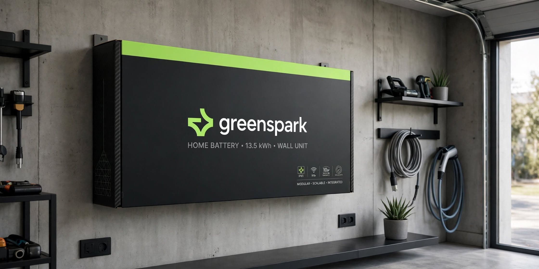
The visual identity translates GreenSpark's positioning into a modern, optimistic design system. A distinctive geometric symbol creates recognition, while bold Albert Sans typography gives the brand a clear and confident voice. The vibrant Energy Lime provides a memorable focal point, balanced by darker industrial tones, softer neutrals, and complementary colours. Together, the elements create an identity that feels contemporary and energetic while remaining approachable and adaptable across digital and physical applications.

Bringing Clean Energy into Everyday View
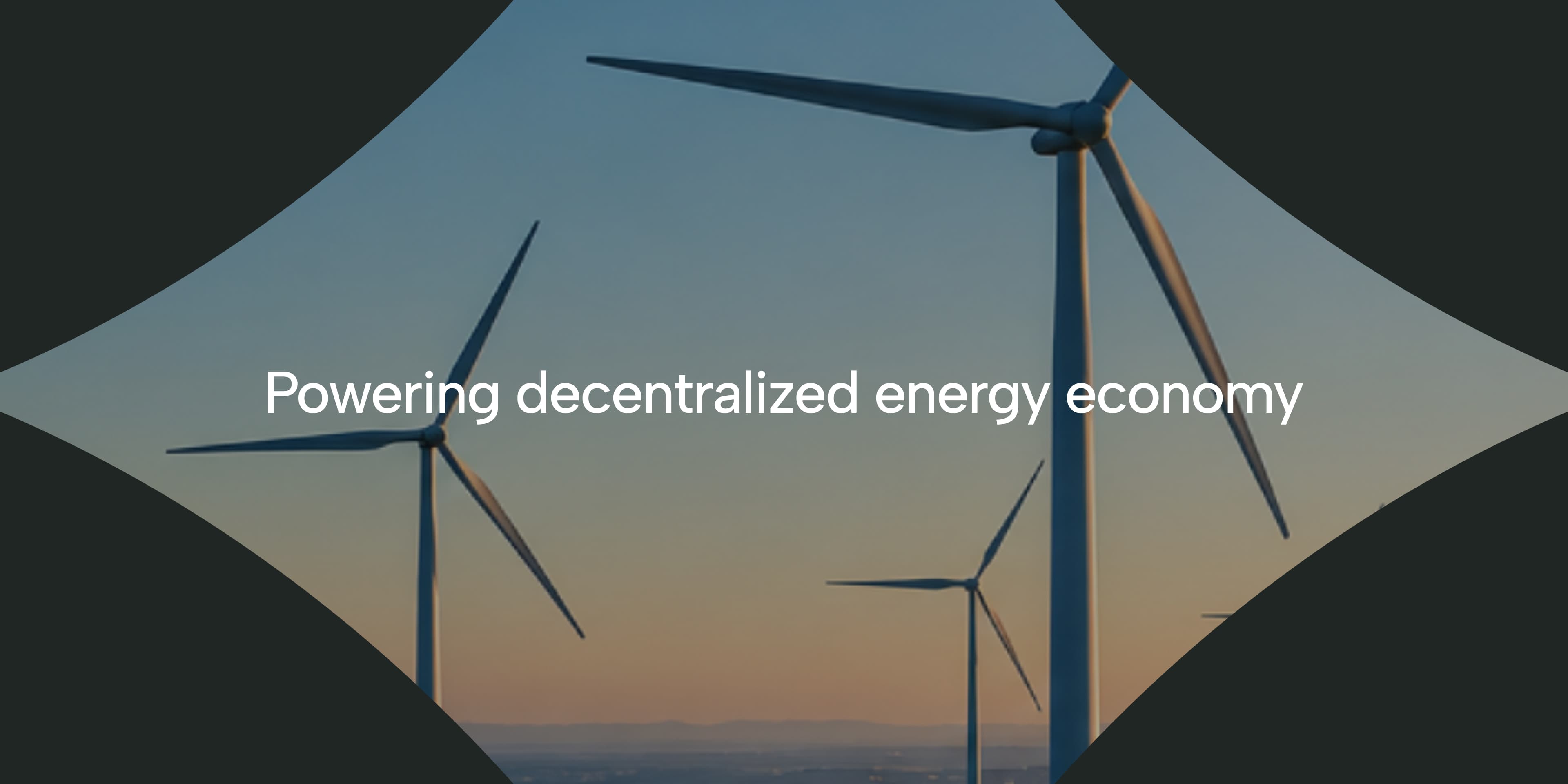
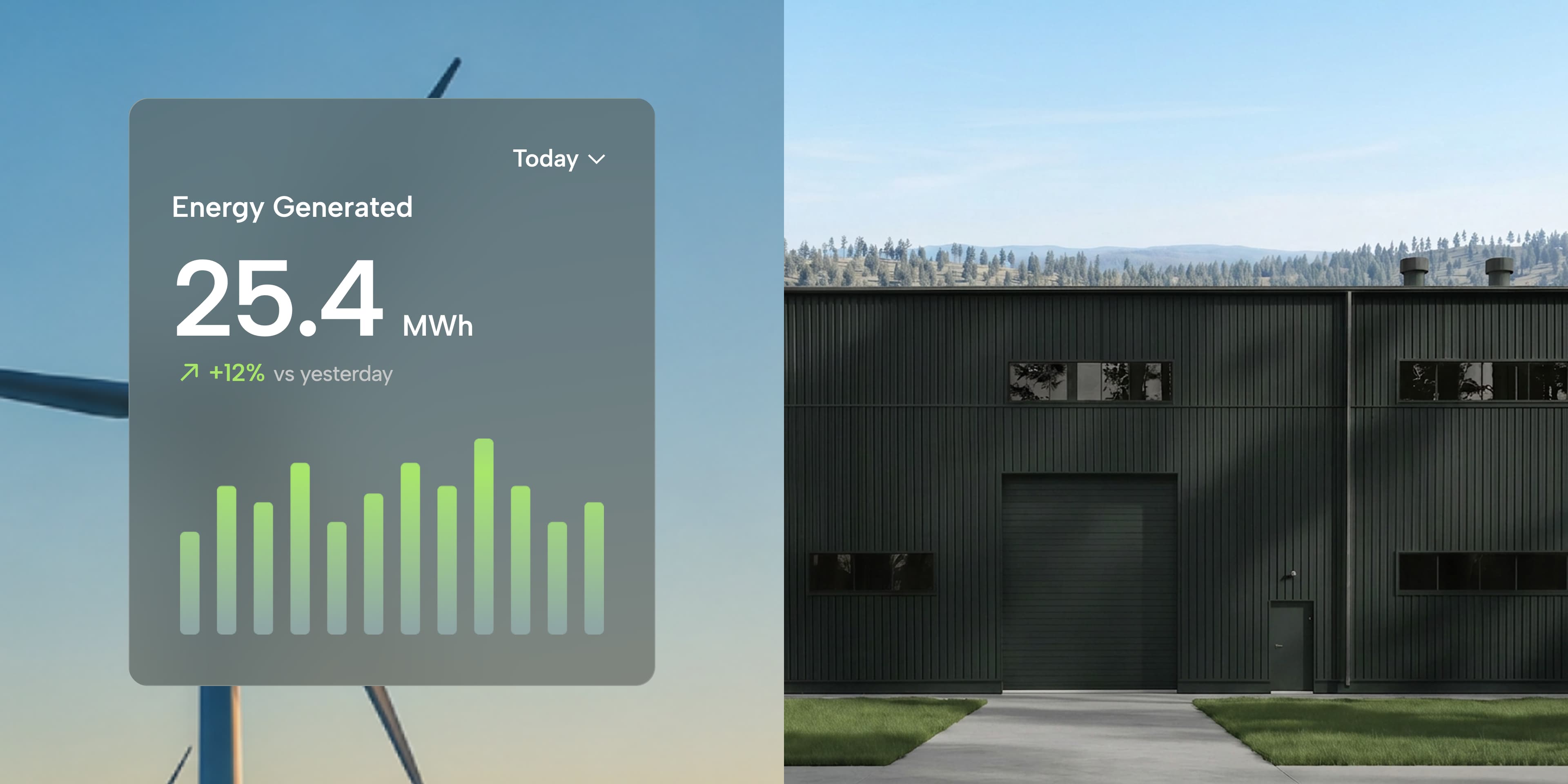
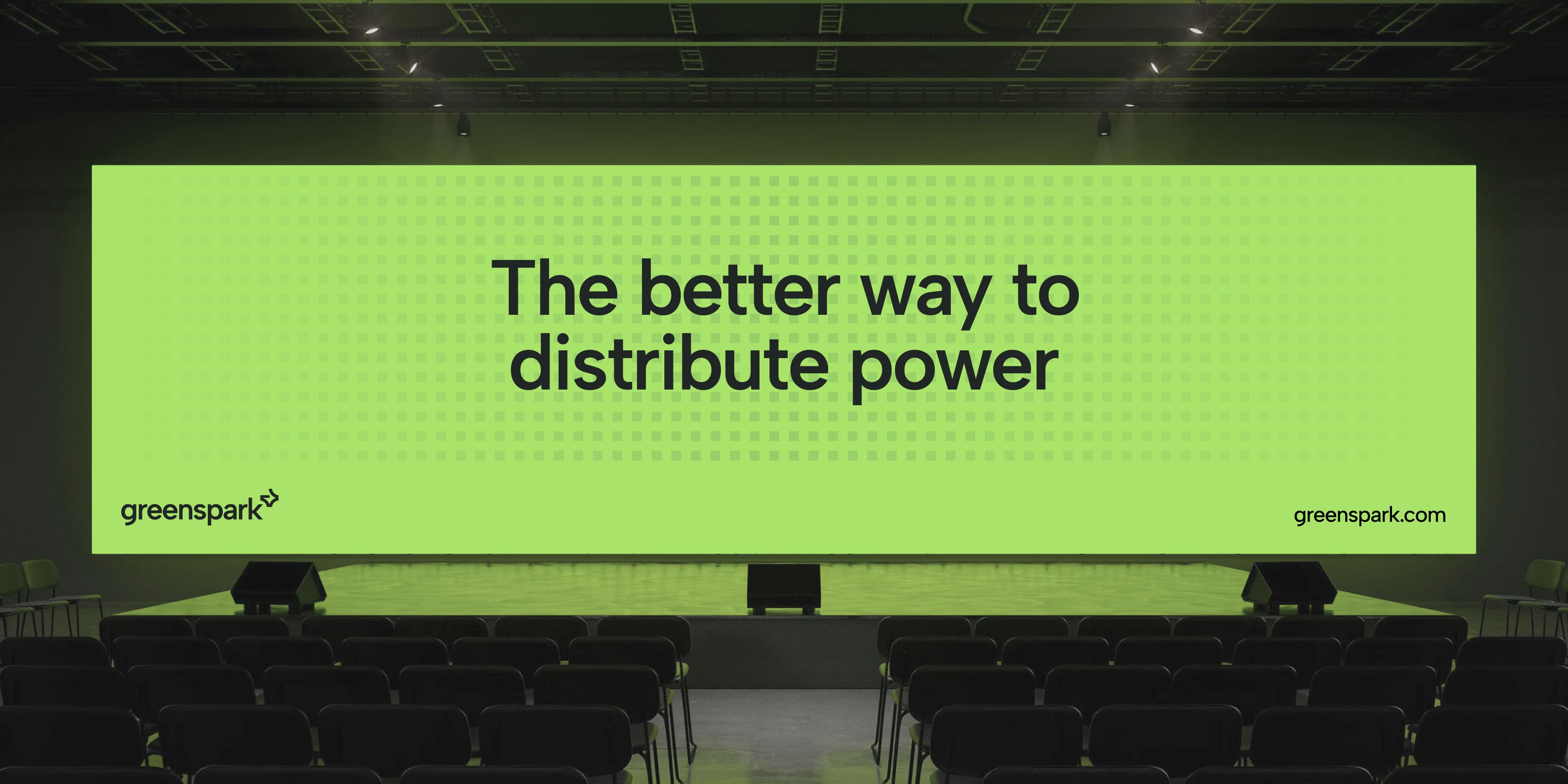
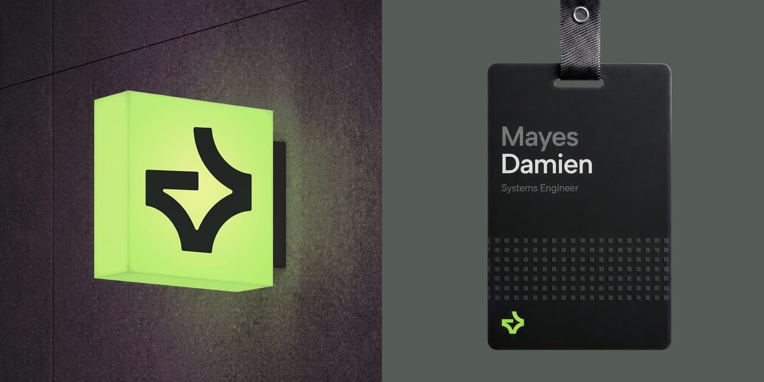
The identity extends beyond the logo into advertising and customer-facing applications. Campaign concepts include outdoor billboards, digital graphics, landing-page imagery, exterior signage, and branded workplace applications. Across these touchpoints, consistent typography, colour, imagery, and messaging help make GreenSpark recognisable while reinforcing its central message: clean energy can be practical, accessible, and easier to understand.
Categories
GreenSpark Energy
Making Clean Energy More Accessible
GreenSpark Energy is a fictional renewable energy company created to make clean energy simpler, more accessible, and easier to adopt. Serving homeowners, businesses, and communities, the brand brings together innovative energy solutions and clear communication to make the transition toward a cleaner future feel more achievable.
Making Clean Energy Feel Within Reach
Renewable energy offers significant possibilities, but for many people, understanding the technology, costs, and available solutions can feel overwhelming. GreenSpark needed a brand that could simplify the conversation, build trust, and make renewable energy feel less intimidating. The challenge was to communicate innovation without unnecessary complexity and sustainability without relying on predictable environmental messaging.
From Uncertainty to Confidence
GreenSpark was positioned as an approachable renewable energy partner, making clean energy easier to understand, trust, and adopt. Its messaging centres on accessible energy, meaningful innovation, sustainable progress, and trusted partnership. Guided by the Explorer and Caregiver archetypes, the brand communicates optimism, innovation, and a people-first approach.
Energy with a Clearer Perspective
The visual identity translates GreenSpark's positioning into a modern, optimistic design system. A distinctive geometric symbol creates recognition, while bold Albert Sans typography gives the brand a clear and confident voice. The vibrant Energy Lime provides a memorable focal point, balanced by darker industrial tones, softer neutrals, and complementary colours. Together, the elements create an identity that feels contemporary and energetic while remaining approachable and adaptable across digital and physical applications.
Bringing Clean Energy into Everyday View
The identity extends beyond the logo into advertising and customer-facing applications. Campaign concepts include outdoor billboards, digital graphics, landing-page imagery, exterior signage, and branded workplace applications. Across these touchpoints, consistent typography, colour, imagery, and messaging help make GreenSpark recognisable while reinforcing its central message: clean energy can be practical, accessible, and easier to understand.
Other Case Studies